
Notice
Recent Posts
Recent Comments
Link
| 일 | 월 | 화 | 수 | 목 | 금 | 토 |
|---|---|---|---|---|---|---|
| 1 | 2 | 3 | 4 | 5 | ||
| 6 | 7 | 8 | 9 | 10 | 11 | 12 |
| 13 | 14 | 15 | 16 | 17 | 18 | 19 |
| 20 | 21 | 22 | 23 | 24 | 25 | 26 |
| 27 | 28 | 29 | 30 |
Tags
- aws lightsail
- JavaScript
- Algorithm
- nextjs
- NextAuth
- cookie
- 버블정렬
- 빅오
- 큐
- 정렬
- textarea autosize
- 슬라이딩윈도우
- styled-components
- tailwindcss
- 스택
- 라이프사이클
- js알고리즘
- 투포인터
- TypeScript
- react-query
- nestjs
- 해쉬
- next.js
- 블로그만들기
- never타입
- isNaN
- typscript
- 알고리즘
- 그리디
- react
Archives
- Today
- Total
far
[React blog] 5. 메인화면 만들기 본문
이제 블로그의 메인화면을 만들어야 하는데, 그 전에 저번에 만든 Signup과 Login의 디자인을 AppLayout으로 감싸줘야 /login, /signup으로 들어갈 때 네비바가 상단에 보인다.
return (
    <AppLayout>
      <SignupContainer id="container">
        <Header>Sign-Up</Header>
        <!-- ... 생략 -->
      </SignupContainer>
    </AppLayout>
)
Footer도 필요하기 때문에 만들어 준다.
// components/footer/footer.styles.tsx

import styled from "styled-components";

export const FooterContainer = styled.footer`
  position: absolute;
  bottom: 0;
  left: 0;
  width: 100%;
  background-color: #f2f2f2;
  padding: 1rem;
  display: flex;
  justify-content: center;
  align-items: center;
`;

export const FooterWrapper = styled.div`
  display: flex;
  justify-content: space-between;
  align-items: center;
  padding: 0 3rem;
  width: 100%;
  @media screen and (max-width: 768px) {
    padding: 0 1rem;
}
`;

export const FooterText = styled.p`
  font-size: 14px;
  color: #666;
  text-align: center;
  margin: 0;
  @media screen and (max-width: 768px) {
    font-size: 10px;
}
`;

export const FooterImage = styled.div`
  display: flex;
  align-items: center;
  @media screen and (max-width: 380px) {
    flex-direction: column;
}
`
임시로 footer가 바닥에 고정되도록 만들었는데, 이 경우 스크롤이 생겼을 때 footer가 바닥에 딱 붙는 형태로 나오지 않기 때문에 따로 수정을 해줘야한다.
import React from "react";
import { FooterContainer, FooterImage, FooterText, FooterWrapper } from "./footer.styles";

const Footer = () => {
  return (
    <FooterContainer>
      <FooterWrapper>
        <FooterText>Copyright© . All right reserved.</FooterText>
        <FooterImage>
          <!-- 이미지 -->
        </FooterImage>
      </FooterWrapper>
    </FooterContainer>
  );
};

export default Footer;
주석으로 이미지라고 적어둔 부분에 나는 깃허브 이미지를 넣고 링크를 걸어두었다.
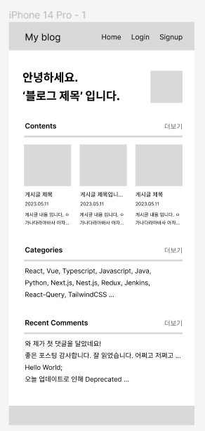
피그마로 와이어프레임을 만든다.
CSS작업은 모바일 -> 웹 순서로 하는게 덜 꼬이기 때문에 먼저 모바일 버전을 만들었다.
디자인은 본인 마음에 드는대로 만들거나 라이브러리의 도움을 받아서 만들어준다. UI 라이브러리를 사용하면 모바일 <-> 웹이 알아서 맞춰지는 경우가 많기 때문에 매우 편하다.
'React > Blog만들기' 카테고리의 다른 글
| [React blog] 4. 백엔드와 연결하기 (0) | 2023.05.04 |
|---|
'React/Blog만들기' Related Articles
more

Comments